Josh Birch's AS Media Blog
Tuesday, 10 May 2016
Wednesday, 23 March 2016
Evaluation Question 7
Welcome back! Today, I will be answering Evaluation Question #7!
Evaluation Question #7: Looking at your Preliminary Task what do you feel that you have learnt in the progression from it to the full product?
So I will be showing you technical aspects to the final product compared to the preliminary task. I have created two keyframes in which display problems that we encountered in the preliminary task and how those technical aspects have changed in the final product.
KEYFRAME ANALYSIS
Prelim #1: This is a match on action in which I placed into the keyframe because of a slight development. The preliminary Task match on actions were completely fine however we developed this skill by being more accurate with our match on actions in the full product.
Prelim #2 & Somnium #1: These two clips show development of the 180 degree rule. In which we broke in the preliminary task which you can see in Prelim #2. Somnium #1 shows how we have developed our use of the 180 degree rule by which we didn't break in Somnium. Furthermore, we can also suggest that our development in shot / reverse shots have developed by with in Prelim #2 we changed angle to the person who is speaking at the time and reversed each time for the conversation. Somnium #1 developed this because we added variety to the shot / reverse shot by showing the other persons face when one person was talking. This was to add variety to the shot rather than it being a game of tennis.
Prelim #3 Shows our establishing shot in the preliminary task. We have developed our establishing shot over time in our full product to have a tilt to which we set the location of the film. Compared to Prelim #3, It adds a more diverse entry to the location rather than a stationary establishing shot in which we used for Prelim #3.
Lastly, Prelim #4 shows a continuity error in the preliminary task. This was added to the keyframe because there was no continuity errors within our full product. This suggests that we have improved our awareness of continuity errors both in filming and editing. Furthermore, we can suggest that our improvement of awareness of continuity errors has improved the full product massively compared to the audience satisfaction, meaning that if continuity errors were present within the film then the audience has a chance to see them therefore comments about said errors might have came up in the audience feedback. This shows that our improvement in this technical aspect of the film ultimately has had an effect on the audience.
COMPARING THE PRELIMINARY TASK & PLANNING TO SOMNIUM'S RESEARCH
So in this section I will be talking about all the planning aspects of Somnium in which was not used in the preliminary task and how that effected the films outcome:
- Film Treatment: The film treatment gave us a storyline of the film in which enabled us to visualise the story as a film before conducting more technical research just before filming the product.
- Scripts: The script was baron as well as the preliminary task however, using CeltX, we was able to create a more industry standard script in which helped our planning compared to the preliminary task in which we did not make any script.
- Storyboard: Storyboard's helped us plan exactly how the shots were going to be taken in terms of length, angle and distance. Furthermore, It also allowed us to visualise transitions which were not thought of until the point of creating a storyboard. Again, no storyboard was created during the preliminary task so there was no visualisation as to what the task was going to look like before hand.
- Animatic: An animatic allowed us to utilise and visualise transitions and soundtrack possibilities for the first time in which was important to us as at this point in the planning. We obviously did not create an animatic for the preliminary task in which did not allow us to visualise the product before hand.
ADVANTAGES / DISADVANTAGES OF WORKING IN A TEAM
Next time: Time to say Goodbye! Other songs are available...
Monday, 21 March 2016
Evaluation Question 6
Welcome back! Today, I will be answering Evaluation Question #6!
Evaluation Question #6: What have you learnt about technologies from the process of constructing the product?
This post is an infamous Prezi again! (You know what to do by now...)
The last Evaluation Question is coming up soon! Nearly, the light is at the end of the tunnel...
Next time: I will answer Evaluation Question 7! See you then!
Thursday, 17 March 2016
Evaluation Question 5
Welcome back! Today, I will be answering evaluation question #5!
Evaluation Question #5: How did you attract/address your audience?
So, for this question I have created another video in which is split in half, one half is a narration and the other half is a directors commentary style breakdown of 'Somnium'! It took a long time to record, edit and upload so I hope you enjoy it! (Sorry it's 25 minutes long)
AUDIENCE FEEDBACK
Lastly, I have conducted a short section of research into our audience and asked a few general questions to confirm theories and ideas mentioned in the video above. In this section, I have asked the following questions:
- What did you particually like about 'Somnium' technically?
- What didn't you like particually about 'Somnium' technically?
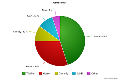
- What genre of films do you favour?
- Would you say the film accurately portrays the thriller genre?
What did you particually like about 'Somnium' technically?
This question was written feedback instead of collectable data therefore I shall be reviewing the comments here. First of all, the audience praised the low key lighting, commenting on the fact that the low key lighting added to the atmosphere of the film opening, creating tension. This is obviously a success due to low key lighting being one of many conventions of thrillers, in which we tried to accept in 'Somnium'. Therefore, this comment proves to us that the convention was accepted successfully.
Furthermore, some audience members understood the dream concept of the film opening. This can be linked back to the 'Reception Theory' in which the audience members chose accept the encoded meaning meant by the technical aspects of the editing and camerawork used to portray the dream idea. The dream idea was a big gamble for the film as we were aware some audience members would not get the idea and therefore had to plan the camerawork and editing in such a way that it became clear to audience members. Consequently, the planned camerawork and editing allowed the dream to be accepted and understood by some audience members deeming it some what successful.
Also, the soundtrack recieved heavy attention from the audience as they thought that the soundtrack was very influencial into the structure of tension being built within the film. They commented on the heartbeat and string crescendo's being the main catalyst for tension building to the audience. Furthermore, they commented on the drones and stingers that were present in the film. They said that the drones and stingers were crucial to the jumpscare being successful as it was. This is obviously a sign from the audience that the jumpscare scared them because of the soundtrack being 'crucial' to it. Consequently, the jumpscares' soundtrack was also successful.
What didn't you like particually about 'Somnium' technically?
This section was very hard for the audience to answer (That's not me bragging by the way) but either way we still have some negatives from the audience.
First of all, on the first observation the audience thought that the lamp turning on was a continuity error as the lamp was a touch sensitive lamp in which to turn it on you only needed to touch the base. Since the audience did not know this, they immediately thought it was a continuity error. This is possibily a mistake on our part in terms of picking props in which we should of thought about the audience more.
Furthermore, the audience felt that the location for Ian's room did not contrast to his gender nor his social group. As quoted, the audience said that the room was "too girly" for it to be a boys room. This is a complication due to the existing room being a girls room. Therefore, when setting up the set, we had to remove some parts of the location to make it seem more feasible to the audience that a boy lives in this room. Clearly, that was particially successful.
What genre of films do you favour?
Would you say the film accurately portrays the thriller genre?
Next time: I will be answering Evaluation Question #6! See you then!
Monday, 14 March 2016
Evaluation Question 4
Welcome back! Today, I will be answering evaluation question 4!
Evaluation Question #4: Who would be the audience for your media product?
For this question, I have created an Emaze so click the magic button and enjoy! (Pretty sure that will be my catchphrase soon...)
Next time: I will be answering evaluation question #5! See you then!
Saturday, 12 March 2016
Evaluation Question 3
Welcome back! Today, I will be answering question 3 of the evaluation questions!
Evaluation Question 3: What kind of media institution might distribute your media product and why?
For this question I have made a power point, so once more, sit back and relax!
Link to the UK Film Distribution post here.
Next time: I will be answering Evaluation Question #4! See you then!
Thursday, 10 March 2016
Evaluation Question 2
Welcome back! Today, I will be answering question #2 of the evaluation questions!
Question #2:How does your media product represent particular social groups?
For this question I have made a little Prezi, so just click the magic button, and enjoy!
Next time: Evaluation Question 3!
Tuesday, 8 March 2016
Evaluation Question 1
Woah! Welcome back! Long time no see, and today is the start of the evaluation questions!
Question 1: In what ways does your media product use, develop or challenge forms and conventions of real media products?
For this question, you'll be seeing my lovely face for the second time, your probably going to have to replace that monitor again by the end of the video though, anyway for this question I decided to record myself answering the question!
You can find the blog post on title conventions here.
You can find the blog post on idents here.
You can find the blog post on thriller deconstructions here.
Next time: Evaluation Question 2! See you then!
Sunday, 6 March 2016
Final Cut
Welcome back!
The time has come, the time for you to witness something special...
(Drum roll please)
It's time to present to you our Final Cut... Somnium!
So sit back, grab your smart water and peanut M&M's, and enjoy!
How good was that! But, unfortunately, this isn't the end of the journey! I still have the dreaded evaluation questions to complete. So goodbye, for now...
Next time: Evaulation Question 1!
Next time: Evaulation Question 1!
Saturday, 5 March 2016
Rough Cut Feedback
Welcome back! Today, I will be evaluating peer feedback on our rough cut for Somnium!
Our feedback we given to us in a video format in which the class was recorded while watching the film opening, here is the video for you to watch:
So here's a list of all the feedback given:
Overall, the feedback given as a whole mainly focused on the editing and soundtrack, In which we can change easily, however, we do want to re-record everything for abosolute continuity. I think that the feedback given was very clear in terms of what we have to improve for our final cut, as listed above. We can use this feedback as a clear indication in our improvements post in order to clearly contrast the rough cut from the final cut.
Next time: Making Improvements! See you then!
- (00:12) - Replace Phoenix Studios with an animated ident.
- (00:38) - Establishing shot is too shaky.
- (01:55) - Title sequence is too fast and cross dissolve looks messy.
- (03:33) - Soundtrack raised the tension too early.
- (05:00) - Fading in and out of sleep is not clear.
- (05:40) - Camera control is not strong.
- (06:00) - Sound effect of footsteps is unrealistic
- (06:35) - Risk of being comedic.
- (07:35) - Have a match-on-action of mark leading into a jumpscare.
- (9:00) - Continuity error, mouth is open in the next shot.
- (9:20) - Technically breaks the 180 degree rule.
- (10:55) - Needs to be more of a panicked shout.
Overall, the feedback given as a whole mainly focused on the editing and soundtrack, In which we can change easily, however, we do want to re-record everything for abosolute continuity. I think that the feedback given was very clear in terms of what we have to improve for our final cut, as listed above. We can use this feedback as a clear indication in our improvements post in order to clearly contrast the rough cut from the final cut.
Next time: Making Improvements! See you then!
Friday, 4 March 2016
Rough Cut
Welcome back! Today is the day! The day that the Rough Cut for out film Somnium is exhibited!
Enjoy...
Next time: Rough Cut Feedback! See you then!
Wednesday, 2 March 2016
Title & Ident Construction
Welcome back! Today, I will be showing you our titles and idents!
If we rewind time a little to the 14th October, I made a post called 'Film Idents Research' so, instead of explaining it all again, click here to view the post!
PHOENIX STUDIOS
Phoenix Studios is like our Paramount Pictures of Warner Bros, the bigger and well known company who distribute the film. Well, Phoenix Studios was created due to our name, Elementa, and one of the elements is fire, therefore, a Phoenix was right to use.
Since we do not have the clip of the ident, let's explain it using good old screenshots!
Here is what the ident looks like towards the end of the clip, after its transition. We used a preset font and gradient within Final Cut Pro.

We used a circle transition to represent when a bird opens its wings in a arc motion. We also used a eagle call sound effect to add to the idea of the phoenix.
ELEMENTA PRODUCTIONS
Elementa productions was a harder ident to creatively think of, however we settled on this design:
We used the transparent logo of Elementa Productions to add the professional look to the ident, however we added productions to the bottom to allow an animation to take place.

What is this animation I hear you ask? Well, we used a wipe transition to push the logo into the center of the screen from the right.

And then 'Productions' pushing from the left.

And that's our two idents created!
Next time: Time to exhibit the Rough Cut! See you then!
Tuesday, 1 March 2016
Editing
Welcome back! Today, I will be showing you our film during the editing phase!
Now that we have filmed, it's time to plug the camera into the Mac and import all of our footage into Final Cut Pro, the editing software we utilise.
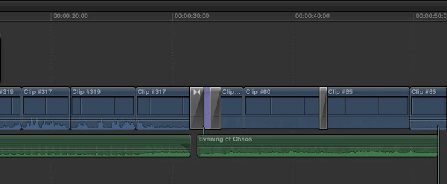
The first stage was to edit the kitchen scene, in which contained a shot/reverse shot. We simply reviewed the clips in the libary and used CTRL+I and CTRL+O to mark where we want the clip to start and end, we then proceeded to add this to the timeline. We did this for each shot until the end of the kitchen scene. Then, we needed a light but erie soundtrack, in which can be found here.
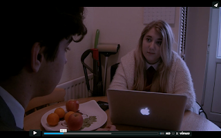
To allow our film opening the dark and erie feel, we had to set the film during night time, however, the camera we recorded with does not like dark places, because of grain. Therefore, we filmed the kitchen scene and establishing shot in broad daylight and used the 'Day Into Night' filter on the clips to give a blue/black tint towards the clip. As you can see, it does give a 'night time' feel to the clip!
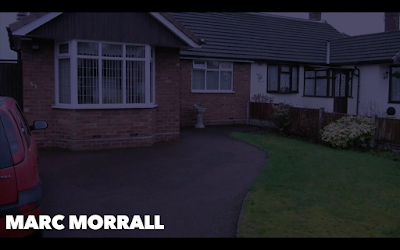

To allow a fludity between the kitchen scene and the bedroom scene, we faded to black for around 1 second. Within this fade, we added our next soundtrack in which can be found here. This acted as a sound bridge for our bedroom scene.
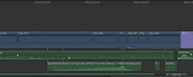
This next part to the editing was vitally important to the film, as creating tension through the soundtrack and the accuracy of editing was a big part of how we wanted to build tension. We used crescendo sound in which allowed us to slowly reveal the other bedroom.
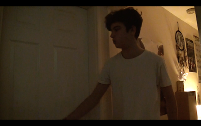
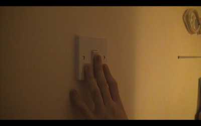
The accuracy of editing really helped in terms of our match-on-actions for the light and door for the build up of tension as it elongated the time for Ian (Marc) to enter the room, in which, with the build up of the sound effect and the original soundtrack, built the tension fantastically. The reveal of Jane (Sara) in the bed turning over relieved tension towards the audience until Bonnie (also Sara) walks into the room. We used a 'piano hit' sound in which was around +12Db in which made the sound incredibly loud to jump the audience. This proceeded with a straight cut to black for the next scene.
Next time: Ident Constuctions! See you then!
Friday, 19 February 2016
Shooting on Location Diary - Day 2
Welcome back! Today, I will present to you the second 'vlog' of our shooting on location diary!
DAY 2 - THE MAIN SECTION OF THE FILM OPENING
Day 2 was another 3 hour slot in which we filmed the rest of the film. We filmed the rest of the film in order from the kitchen scene onwards due to costume changes being minimal.
So let's look at the schedule for day 2:
With the schedule noted let's look at the 'vlog' for Day 2 to give you an insight into how we actually managed to film the rest of the film opening in 3 hours:
WAS IT A SUCCESSFUL DAY?
WAS IT A SUCCESSFUL DAY?
Overall, It was a successful day, we managed to film all of the planned shots with no continuity errors. However, It was a little dark at times, however we can improve that in the final cut. Overall, I thought that the day was handled very professionally considering the few hiccups in the acting etc which are visible in the 'vlog'.
WHAT WAS MY CONTRIBUTION TO THE TWO DAYS OF FILMING?
My contribution to the 2 days of shooting we as follows, make sure that everything is recorded and recorded to the appropriate standard! My role within the film doesn't really kick in till the editing stage. But overall, I thought I did my job very well, I simply worked with Tam, the director, and discussed shots and how we could maybe manipulate and change certain scenes to look aesthetically more pleasing to the audience.
Next time: Editing! Let's see if my skills are any good...
Monday, 8 February 2016
Shooting on Location Diary - Day 1
Welcome back! We've not talked in a very long time, and that is because we have been filming, editing and presenting our rough cut, Somnium! In this post, I will presenting to you the first of two 'vlogs' in which we filmed alongside the filming of our product. These 'vlogs' are exclusive footage from behind the scenes!
DAY 1 - ESTABLISHING SHOT AND KITCHEN SCENE
Day 1 consisted of a 3 hour time slot to film the POV with Ian walking into the house and into the kitchen to greet Jane, with a few pieces of dialogue to finish the day off. But, just to make it formal here is how the day was scheduled:
So, here is our first of 2 'vlogs':
WAS THE DAY SUCCESSFUL?
The day was relatively successful, we started with Marc (Ian) handling the camera because it was a POV in which, the camera would start by pointing towards the house then tilting down into Marc's feet while he walks towards the house.
However, when we came to film the shot / reverse shot, Tam's cat had a fit in which prevented us from filming at our desired location any further. Because of this we had to change location very, very quickly as time was running out. Luckily one of our actors, Sara, allowed us to use her home as our new location.
Due to all of this, we had to record the POV and dialogue at Sara's home before the time ran out which was hectic to say the least.
Next time: Shooting on Location Day 2!
Thursday, 21 January 2016
Shooting Schedule
Welcome back! Today, I will present the shooting schedule for our film 'Somnium'!
WHATS A SHOOTING SCHEDULE?
A shooting schedule is a project plan for each day's shooting for a film. They are usually created by the assistant director and then reported to the production manager then from production manager to the production crew.
WHATS A SHOOTING SCHEDULE?
A shooting schedule is a project plan for each day's shooting for a film. They are usually created by the assistant director and then reported to the production manager then from production manager to the production crew.
Next time: Shooting on location! See you on the set!
Wednesday, 20 January 2016
Actor Release Forms
Welcome back! Today, I will present our actor release forms!
WHAT ARE ACTOR RELEASE FORMS?
Actor release forms are the legal documents that have to be signed in order for the actor to be able to a part of the film. Therefore, if an actor release form is not signed, it's only a matter of time before you have to remove the best shot in the film just because a parent doesn't want their child's face on the internet.
Next time: Shooting Schedule!
Tuesday, 19 January 2016
Risk Assessment
Welcome back! Today, I will present our risk assessment table as well as a little explanation into what they are and why they are used.
WHAT ARE RISK ASSESSMENTS?
Risk assessments are a process in which the activity (in our case, it is shooting on location), is evaluated for potential risks that might occur during the activity.
WHY DO WE NEED A RISK ASSESSMENT?
We need a risk assessment to secure safety for all crew members and actors when shooting on location in which they will be clearly informed of what the risks are. Basically, health and safety is very important in the 21st century, therefore building a risk assessment allows clear checks to be placed onto the location which will enable to avoid those risks and ultimately pass the location off as a 'safe' location.
'SOMNIUM' RISK ASSESSMENT
Next time: Actor Release Forms!
Friday, 15 January 2016
Animatic
Welcome back! Today, I will exhibit our Animatic!
Next time: Risk Assessments! See you then!
Sunday, 10 January 2016
Animatic Research
Welcome back! Today, I will conduct some animatic research including an example from an existing product! So sit back, this could be a long one...
First of all, let's get the research part out of the way shall we...
Now, let's have a look at an animatic from an existing film.
As you can see with this animatic, it has probably been re-made many times to make it perfect, as it is pretty much the exact same of the final product!
Next time: I will exhibit our animatic! See you then!
Saturday, 9 January 2016
Storyboard Research
Welcome back! Today, I will present some storyboard research! After that, I will present our storyboard for our main product!
WHAT IS A STORYBOARD?
As its definition, a storyboard is a sequence of drawings, typically with some directions and dialogue, representing the shots planned for a film. In which are laid like this:

Within this, you can see that titles are also designed within the storyboard in which also contains the transitions to which it will utilise. Furthermore, time frames are also noted for each of these scenes.
EXAMPLE OF A STORYBOARD
So, let's look at Harry Potter and the Deathly Hallows Part 2, in particular the scene in which Nagini, Voldemorts snake, attacks Harry.

As you can see, the storyboard contains a description of the shot and a transition between each box.
WHAT IS A STORYBOARD?
As its definition, a storyboard is a sequence of drawings, typically with some directions and dialogue, representing the shots planned for a film. In which are laid like this:
Within this, you can see that titles are also designed within the storyboard in which also contains the transitions to which it will utilise. Furthermore, time frames are also noted for each of these scenes.
EXAMPLE OF A STORYBOARD
So, let's look at Harry Potter and the Deathly Hallows Part 2, in particular the scene in which Nagini, Voldemorts snake, attacks Harry.
As you can see, the storyboard contains a description of the shot and a transition between each box.
Now let's compare it to the actual scene! Starts around (2:25)
The actual scene contains Harry standing up with a chair in his hands as Nagini is revealed. Nagini does strike the chair as shown in box 'B' as well as a direct cut back to Nagini when she strikes again and forces Harry into another room. To conclude, the storyboard does not match the actual scene completely.
OUR STORYBOARD FOR 'SOMNIUM'
Next time: I will conduct animatic research! See you then!
Saturday, 12 December 2015
Props Research and Props List
Welcome back! Today, I will present props research and create a props list in which will feature within our film opening!
FORMAL PROPS LIST
Friday, 11 December 2015
Costume Research
Welcome back! Today, I will present our costume research and how our characters will dress during our film opening!
Costume is a big part to the identity of each character in which, we have thought about a lot, but we'll get to that later on. Now, costume can determine the background of a person, personality of a person, lifestyle of a person and attitude of a person.
SUIT AND TIE
A suit and tie represents a formal and more sophisticated lifestyle in which the person is represented as more neat and more intelligent. Furthermore, this means that their status might be more higher compared to a person who wears a tracksuit.
EXAMPLE 'SKYFALL'
TRACKSUIT
There are two sides to this outfit, so let's talk about the first one. First of all, this outfit is seen as a very active outfit, the person wearing this represents good health by exercise and a sporty personality, in which would represent to the audience that this person is incredibly fit. However, the other side to this outfit can represent a lower class, more laid back, rebel attitude person. Basically the word 'Chav' springs to mind when you see this outfit, in which the audience can see which would allow them to suggest that the person is a rebel or in the film. to cause mischief in the film.
EXAMPLE 'GREEN STREET HOOLIGANS'
tracksuit seen first at (0:32)
GLASSES
Glasses can be worn to increase the look of intelligence of the character in which glasses are typically used to portray a nerdy character. Glasses are an easy way to differentiate social groups, having a group of teenage boys with big glasses can represent a nerd social group where as other people without these big glasses can be 'outcasts' of the group. Therefore, glasses are important when representing the overall personality of the character.
EXAMPLE 'DIARY OF A WIMPY KID 3: DOG DAYS'
Nerd first seen at (1:07)
A 'EMO' OUTFIT

This outfit comes from a sub culture in which I can happily talk a lot about. This outfit symbolises a really bad attitude towards life, education and other people around them. Grey and black is very dominant within these types of outfits in which represents an emotionless, dull, plain and rebel person.
EXAMPLE 'DONNIE DARKO'
FINAL COSTUME LIST
Next time: I will present props research and a formal props list for our main product!
Thursday, 10 December 2015
Location Research
Welcome back! Today, I will present my location research, including an insight into our location and how the location will represent the characters.
RESEARCH
When we initially discussed our film, we considered how our location will represent the characters in the film. However, since there is two characters, in which are male and female and are mostly featured in their bedrooms, you would expect these stereotypical locations for their bedrooms.
Here, you can see a 'girly' bedroom. Stereotypically, we would see this as a girly bedroom because of the use of pink and white within the room. This represents feminism in which is portrayed by the wallpaper and tidiness of the room. Furthermore, this particular bedroom would fit a young girl more than a teenage girl due to the lack of technology in which teenagers are exposed to constantly in today's society.

On the other hand, this bedroom represents a teenage boy. Within this, you can see that the bedroom is in a messy state in which is represented within teenage boys stereotypically. Furthermore, a dull colour scheme is used to represent the lack of activity that this teenager has due to the messy state of the room indicating that the teenager is in this room frequently.
KICK - ASS
In Kick Ass, the stereotypical boy's bedroom is portrayed to the audience as the boy puts on his superhero costume on. Within this, you can see how messy the room is, the unmade bed, the clothes on the chair and the messy desk all stereo typically portray a teenage boy's bedroom.
Wednesday, 9 December 2015
Script Research
Welcome back! Today, I will present some research into scripts and present the script for our product, Somnium!
WHAT IS A SCRIPT?
By definition, a script is a piece of written text of a film. In which, outlines the movements, actions, expressions and dialogues of the characters within the product. It is important to create a script as without this, the characters would not know how to portray the character within the film. Therefore, creating a script enables the actors to be fully aware of their role in the film.
An example of a script layout...
An example from a real media product...
Now that I have researched into an example from a real media product, we, as a group, could conduct a script for our film opening 'Somnium'.
SOMNIUM SCRIPT
Next time: I will present location research! See you then!
WHAT IS A SCRIPT?
By definition, a script is a piece of written text of a film. In which, outlines the movements, actions, expressions and dialogues of the characters within the product. It is important to create a script as without this, the characters would not know how to portray the character within the film. Therefore, creating a script enables the actors to be fully aware of their role in the film.
An example of a script layout...
An example from a real media product...
DESPICABLE ME 2
Now that I have researched into an example from a real media product, we, as a group, could conduct a script for our film opening 'Somnium'.
SOMNIUM SCRIPT
Next time: I will present location research! See you then!
Sunday, 6 December 2015
Film Treatment
Welcome back! Today, I will discuss film treatments!
WHAT ARE FILM TREATMENTS?
Film treatments are almost the short story version of the film. It details all the events that entail within the film including camera shots and the setting of the scene. Film treatments are usually written to tell the overall story of the film so that when producing the film, we can be more structured with our setting and camera shots at particular points in the opening.
Here is an example of a film treatment...
So, with the research out of the way, together we constructed our film treatment!
Here is our film treatment!
Next time: I will discuss and present scripts!
WHAT ARE FILM TREATMENTS?
Film treatments are almost the short story version of the film. It details all the events that entail within the film including camera shots and the setting of the scene. Film treatments are usually written to tell the overall story of the film so that when producing the film, we can be more structured with our setting and camera shots at particular points in the opening.
Here is an example of a film treatment...
So, with the research out of the way, together we constructed our film treatment!
Here is our film treatment!
Saturday, 5 December 2015
Role of the Sound Editor & Film Score Composer
Welcome back! Today I will talk about the role of the sound editor and film score composer! I will also discuss the Wilhelm Scream and
SOUND EDITOR
The sound editor is the person who is in charge of selecting and arranging sound clips ready for the final sound mix for the film. There are 3 aspects to the final mix, dialogue, special effects and music. Now, if the film is funded heavily in terms of production then the sound editor will be allocated to one of these aspects, in which there could be up to 3 different sound editors depending on the financial backing.
JONATHAN MILLER
An example of a sound editor is from my favourite film, Saw, Jonathan Miller. Miller is more tailored to the horror genre in which he has featured in the sound department for Saw, Evil Dead and The Hills Have Eyes II. In 2005, Miller was nominated for a Golden Reel award for his work as a sound editor.
RICHARD KING
Another famous sound editor is Richard King, who has worked on The Dark Night, The Dark Night Rises and Inception. As a result of his work, he has won 3 Oscars and been nominated 22 times for other awards.
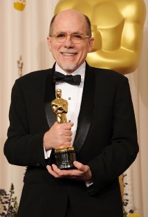
THE SOUND OF INTERSTELLER
FILM SCORE COMPOSER
A film score composer is a person who creates an original, unique piece or collection of music for a film. In which, these pieces are heavily influenced off of the piece of film that it will be accompanying. Film scores are usually orchestral, instrumental or choral pieces in which complement the film to increase the dramatic aspect of the scene.
HANS ZIMMER
Hans Zimmer is a film score composer in which he has created film scores for many films including Inception, Gladiator and The Dark Night Rises. Since 1980, he has produced film scores for over 150 films.
THE SOUND OF THE DARK KNIGHT RISES
WILHELM SCREAM
The Wilhelm Scream is a universal sound effect in which has been used in almost 500 movies starting with 'Distant Drums'. The scream is used when someone is shot and falls from a large height or is thrown from an explosion. Because this sound effect is used so much, it started to develop into more of a 'joke sound effect'.
Here are a few examples!
Here are a few examples!
Next time: I will discuss and present my film treatment!
Thursday, 3 December 2015
Recording Sound on Location & ADR
Welcome back! Today, I will talk about a number of different aspects to recording sound; How to record sound on location, ADR, Foley, the audio codes and finally the impact of an inappropriate soundtrack! So, let's get started!
RECORDING SOUND ON LOCATION
Recording sound on location is a different method of recording sound compared to Foley. We record sound on location using the location recording kits provided. In which, contains a sound recorder and a mic with a windshield to soften the sharp sounds e.g. 'P's' and 'B's' in which 'clips' the audio. Finally, the kit also contains headphones to listen to the audio as it is recorded.
Here is a step my step guide to recording sound on location!
So, as you can see the process of recording sound on location is quite lengthy and it does have its drawbacks. For instance, if I wanted to record a conversation but the one person is on one side of the room and the other person is on the other side of the room, then I would need to use a boom in order to extend the microphone to allow the other person to be heard more clearer and louder. As a result, the sound recorder could dip the boom during recording in which would be seen on camera which would result into a continuity error.
ADR
When dialog cannot be taken from production tracks, they must be re-recorded. This is called 'ADR' (Automated dialog replacement).
The actor watches the film repeatedly until they feel comfortable to repeat the dialog perfectly in time for it to be then placed into the films audio. Then, they record the dialog in sync to the film in which must match the lip movements. This can be a long process due to the actors ability to sync the dialog to the film. Therefore, there is an alternative method called 'looping'. Looping consists of looping the film while the actor continues to repeat the dialog.
FOLEY
Foley derives from Jack Foley, who is a sound editor at Universal Studios. Foley artists match sound effects with the live action of the film. Using Foley is a great way of expressing subtle sounds in which production mics might not pick up. With these subtle sounds comes a sense of realism within the film. The Foley crew will include a 'walker' in which creates the sounds using particular objects, and a technician to mix the sounds together.
AUDIO CODES
Below, I have researched the appropriate audio codes using this website.
- Sound Recorder - records the sound on location.
- Condenser Microphone - external microphone that uses an XLR connection to record sound.
- Windshield - Prevents sharp sounds of dialog clipping the audio.
- Headphones - Listen to the audio as it is being recorded.
- Diegetic Sound - Sound that is visible in the film.
- Non - Diegetic Sound - Sound that isn't visible in the film.
- Parallel Sound - Sound that complements the film.
- Contrapuntal Sound - Sound that that contradicts the film.
- Synchronous Sound - Sound that matches the action - footsteps while seeing someone walk.
- Asynchronous Sound - Sound that matches the action however, not at the exact time.
- Voice over- A narration that plays over the top of a piece of film.
EXAMPLES OF THE AUDIO CODES
Next time: I will discuss Sound Editors and Film Score Composers!
Next time: I will discuss Sound Editors and Film Score Composers!
Sunday, 29 November 2015
Film Pitch... Somnium
Welcome back! Today, I will discuss, feedback and evaluate my film pitch!
FILM PITCH... SOMNIUM
Our pitch was based around the discussions that we had before the process of making the logo and the team name. We wanted to fully outline the points we wanted to consider early on in the process of the film. In which, we outlined these considerations:
- The meaning of the name of the film.
- The protagonist.
- The antagonist.
- Any other characters that feature.
- Conventions that we are going to use.
- Conventions that we are going to challenge.
- Location, props and time.
- Our narrative.
- Target Audience Profile.
- Titles with our logo design.
With many discussions and planning we used prezi to create an animated presentation in which gave the pitch that essence of a journey. With this, I used the colours from our logo in order to portray a colour scheme to the audience at the same time.
Here is our pitch!
FEEDBACK
With this pitch came a lot of feedback which was more directed towards our narrative. First of all, we were questioned on our lighting choices. With this, we were criticised on the option to just use a lamp as our light source to achieve low-key lighting. In which, we discussed in our group that we are going to film the product within the day and post edit the footage so that the video takes the look of being set at night.
Next, we were criticised on our opening of the opening... if that makes sense. It was suggested that we outline that the protagonist and the antagonist are university students by using an establishing shot of a university and then showing a conversation between the two characters. Because of this, we will add this due to the fact that there is evidence of an equilibrium at the beginning of the film.
With this feedback we can now discuss and plan key areas before filming the main product including location, costume design and scripts. Overall, we are content to add this to our plans and therefore create an even better main product that what we originally were going to make!
Next time: I will be discussing recording of sound on location!
Next time: I will be discussing recording of sound on location!
Wednesday, 25 November 2015
Target Audience Profile
Welcome back! Today, I will present research into existing products' target audience profile and present our main products target audience profile!
Outlining a target audience profile is very important to the structure of our main product, therefore we have created a detailed 'TAP' so that it reflects our choice of film classification. However, before that I will conduct some research on existing products in which I will observe their target audience data and then present our target audience profile!
THE CONJURING
The conjuring predominantly adopts the horror genre as well as thriller, in which is what genre we will be revolving our product around. Therefore, I have used this film due to it's classification in which is "15" which is our classification aim too therefore I can then observe the target audience profile and tell that the classification correlates to the majority of the audience being between the age of 15 and 24 (69%). This links to our target audience profile as our 'ideal viewer' is 20 years old, therefore he fits the bracket.
Now, let's talk about the film itself. I chose this film specifically because of the amount of low-key lighting that is within it, in which I can observe and brainstorm about how I can achieve low-key lighting in my main product in which is one of our main conventions within the film opening. Consequently, low-key lighting increases the tension towards the end of the film in which builds the horror element. Therefore, because the tension certainly scared me I must take this into consideration. However, I don't want to scare the audience, I want to make them feel feared and intrigued about what's going to happen next. Therefore, I need to be able to pick out props within the misé-en-scene in which are the catalyst for low-key lighting and identify them.
To conclude, the vast majority of props that produced the low-key lighting were lamps of a low brightness. Therefore, we might need to record the opening during the day and post edit the footage so that the lamp on the bedside table is significant and the location looks like it is in a night time setting. The reason why I might do this is because if we was to film it at night with just a lamp as a source of light, then the audience might not be able to see the character at all, in which won't make them feel feared nor intrigued. Furthermore, the film quality will be extremely grainy in which we don't want present in our main product.
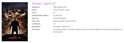
HITMAN: AGENT 47
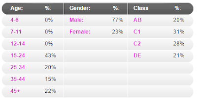
Hitman: Agent 47 adopts the action genre, however it still has a very heavy thriller feel towards the films plot and timeline throughout the film. Again, this film has the classification "15" in which we will be attempting to conduct within our film opening. However, with this movie I want to focus on the target audience profile section. Even though the classification is 15, the percentages are spread out all the way to 45+. Time for a history lesson, Hitman originated from a video game in which was platformed on PC back in 2000. Now, i'm going to be quite stereotypical here but when it comes to video games, the dominant sex is male, and this contrasts to the gender section of the target audience profile. Ultimately, what i'm saying is that since this was originally a video game and males generally play video games more than females and the fact that this game has been developed into more games and ultimately more films, means that the older generation are viewing this movie too, as well as the younger audience from the more recent video games. To conclude, this film contrasted with the video games to pull their audience in.
Now, for the film itself. I chose this film purely for the tension element. In our main product we want to express tension to fully convey the conventions of a thriller, in this film it is conveyed really well. They do this in a very simple way, close ups and tense music. Close ups of agent 47's face is shown in some situations in which tense music is played to increase the suspense of the assassination, this includes tense music in which intrigues the audience. This allows me to take inspiration from this and possibly add this to our main product in which could improve our initial ideas of building tension. Therefore, to conclude I will simply use this film as inspiration for tension.
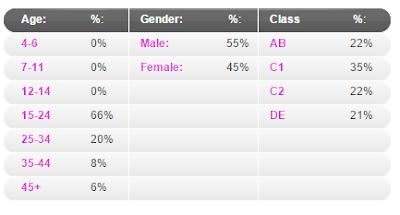
THE PURGE: ANARCHY
The Purge: Anarchy is purely thriller. It moulds all the thriller conventions into one to make your typical thriller film. As usual, the classification is "15" which is expected after the first two pieces of research. We can also see that the classification contrasts with the 15-24 bracket age at 66%. Why? well, lets look at the the first image but more specifically, the 'The Story' section. It details 'A young couple', the reason why the highest age bracket is 15-24 is because there are a young couple as the main characters in which the majority of the audience at 15-24 can relate to and therefore form a bond in similarity because they are young and the audience is young in which changes the audiences' perspective of the film, and not in a good way. That puts the audience within the film and forces them to experience the young couples fear and trauma.
I chose this film because it ties the first two films together. The Purge: Anarchy moulds both low-key lighting and tension together. How? Well, it's very simple. Using the low-key lighting, antagonists are prevented from being seen, therefore it builds a lot of tension for the young couple in which are feared, therefore, the combination of low-key lighting and tension pin points the thriller genre perfectly. I can use this as inspiration for my main product as we are planning on using low-key lighting and tension to slowly introduce a character that cannot be seen in which the audience will feel how they felt when they watched The Purge: Anarchy.
'SOMNIUM': TARGET AUDIENCE PROFILE
With this research concluded I can now present to you a detailed target audience profile for our film 'Somnium'.
Next time: I will present film title designs! See you then!
Thursday, 19 November 2015
Production Team Name & Logo
Welcome back! Today, I will present my production team name which will include 3 draft logo designs, concluding with our final logo design!
PRODUCTION TEAM NAME
First of all, I will talk about the painful process of our production team name. As a group, we used a particular rule in which would make it easier for us to find an appropriate name, we took positive words for example, best, brave, bright or strongest and translated them into Latin (Hint! Words always sound cooler in Latin!) Here is the official list we composed:
- Fortissimum (Strongest)
- Ignis (Fire)
- Elementa (Elements)
- Exemplar (Original)
- Dulce (Sweet)
- Optimum (Best)
- Lux (Bright)
After endless discussions, we all decided on the name 'Elementa'. Why? Well, Elementa is the Latin word for 'elements' in which there are four; fire, water, air and earth. Now, since there are four people in our group we saw it fit to be our name because it ultimately represents us in a specific way in that it shows all four of us have different elements that are stronger when referring to our skills within Media. It symbolises that all four of us are different and that is what makes us the best, the fact that we can produce the best product by combining our strengths in media together. Therefore, our whole ethos as to say of our team is to create a fantastic product, using the 'elements' of the group, in which are our version of those elements which are media related.
LOGO'S
With that discussed and decided, we could then move onto logo's. We wanted to show what our team was inspired by using the colours of the elements and symbols of the elements in order to portray to the audience a sense of recognition in which they will see the logo and know who we are, our ethos and our purpose. Therefore, I was asked to create 3 draft logo's since I am technically advanced as to say.
DRAFT 1:
Here is the first draft. Now, you're probably thinking there's too much going on here, and that's what prevented us from picking this logo. Indeed, we have shown the elements and media crossover however we thought this was ultimately too 'tacky'.
DRAFT 2:
Here is the second draft. In this draft, I decided to focus more on the colour scheme and how the logo can be manipulated in different ways. First of all, the colour scheme is important with our name due to the 'elements' aspect to it, therefore I needed to portray that very clearly within the logo. I felt like I achieved this with thanks to the tiled image next to the text in which I used the colour code of the four tiles to cross over the colour scheme well with the text. However, we first felt that the font was too 'off putting' in which I could have happily changed the font, until we decided that there was another design which was more simple and elegant.
DRAFT 3:
Here is the third draft. Personally, I really liked this design, the font was suitable and the layout was unique with the little shape coming off the 'A' at the end of 'ELEMENTA'. That shape symbolises the 'air' element out of the four, in which I thought I could easily incorporate into the text. However, colour schemes seemed to be too direct towards the audience. As much as I like this design, we set this aside.
FINAL DESIGN:
And here is our final design! With this, I changed the font to be more readable and simple, as that is what the audience will want from a logo. I also added a colour scheme which displays the elements individually. I then also researched simple shapes to represent the 'air' element in which these intricate, curved lines came to be within our logo. Overall, I am very happy with this logo in terms of its simplicity and its representation.
Next time: I will be detailing a summary of our initial narrative discussions! See you then!
Subscribe to:
Comments (Atom)

